LCC 16: Graphic and Media Design BA Hons
The London College of Communication presents the next generation of creative talent from its BA (Hons) course in Graphic and Media Design. Arts Thread went along and bring you some of the highlights.
The exhibition displayed a broad range of print & digital media including poster design, typography and information diagrams.

Ben Leonard
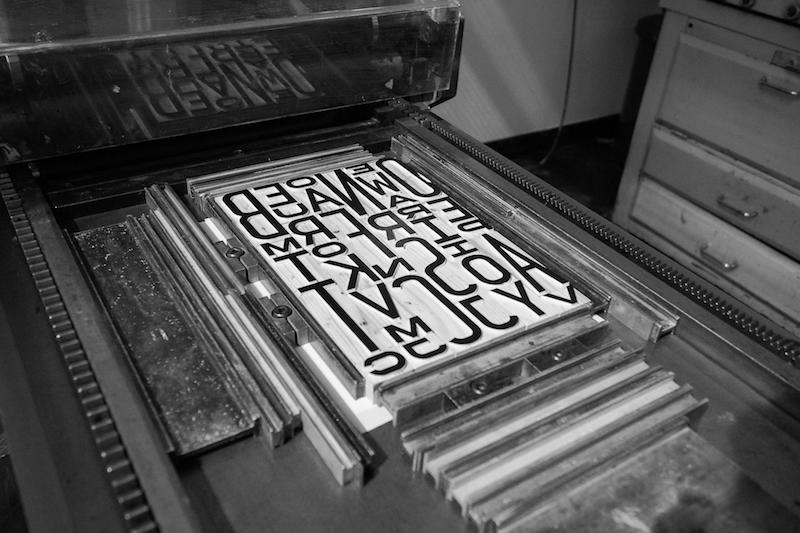
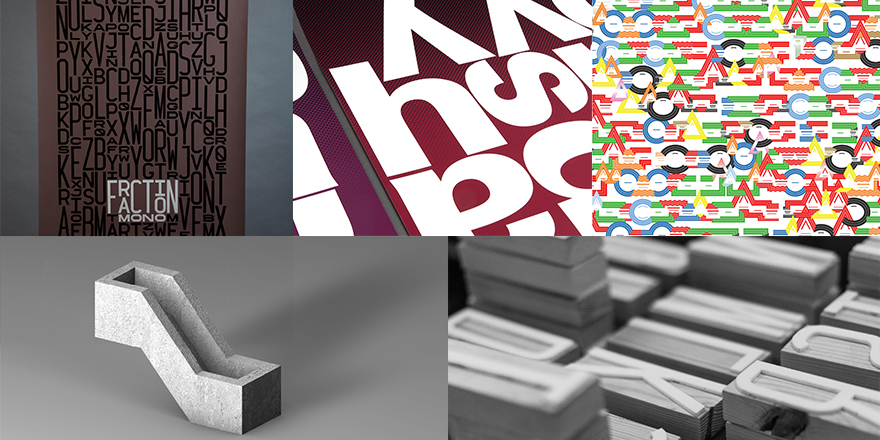
Ben Leonard’s monospaced typeface Fraction Mono is a delight. Created on three heights, condensed, regular and extended, with each doubling in size. The digital typeface was then made into 270 letterpress block letters and used to print posters and other media.

Joey Lim
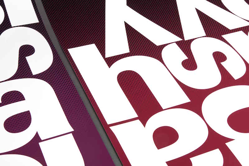
Four of Samuel Beckett plays is the inspiration behind a series of typography based posters designed by Joey Lim. The posters are deliberately confusing in their composition to replicate Beckett’s notion of theatrical absurdity. There is also a subtle screen vignette in the background that grabs the eye.

John Philip Sage
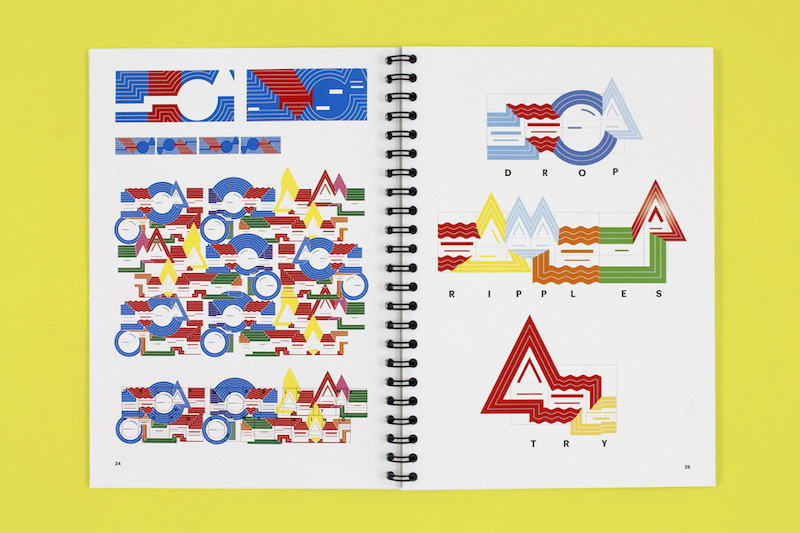
John Philip Sage’s project on sound symbolism looked at transferring language into patterns of shapes and colours. The resulting posters are a riot of colour, shape and design displaying the differences between the three mother tongues (Basque, Spanish and English) spoken by Sage.

Beth Johnson
Brutal Types by Beth Johnson explores the building blocks of Brutalist architecture. The images displayed are 3D rendered letterforms that Johnson has taken from unique and iconic shapes within this architectural style.
Image credits for main image: Clockwise from top left: Ben Leonard, Joey Lim, John Philip Sage, Ben Leonard, Beth Johnson
This review was first published for Arts Thread 16th July 2016


