Author Archives: Andy Dominy

Home / Articles posted by Andy Dominy

Loyalty Card

With new ownership in place Friends Restaurant were looking to introduce a loyalty card scheme to ensure that their local custom did not drop off or fall away while the new management team was bedded in. The card was also a tool to establish a customer base through data capture.

Formula11 proposed using a 4pp carrier to hold the loyalty card that not only explained the offer but also required the customer to fill out the data capture form in order to receive the loyalty/discount card.

The loyalty cards were a huge success with an excellent take up and an increase in repeat bookings. The data capture has helped to keep the customer base informed of the restaurant’s promotions and offers.

Digital Printing from Formula11

Only have a short run requirement? Did you know that Formula11 are now able to supply digitally printed POS and Sales & Promotional products using a variety of plastic materials. Many of your popular bespoke products including window stickers, shelf strips & wobblers, tent cards, ID cards, membership & loyalty cards, document wallets & boxes are now available in low quantities thanks to the latest digital technology. Contact us now for further information.


RCA 16: Design Products MA

The Royal College of Art presents the next generation of creative talent from its MA degree course in Design Products. Artsthread went along to bring you some of the highlights.

The exhibition displayed a broad range of work as the students reflect on the relationship between contemporary design and the challenges that real-world issues bring.


Jan Libera

Jan Libera’s City Trailer for London is a simple cargo trailer borne out of the realisation that many city car journeys, which relate to the transport of goods, could be made by cargo bikes. Libera has made his trailer compatible with the Santander Cycle docking stations around the capital. The aim would be to improve the quality of life within large cities by reducing congestion and both noise and air pollution.


Thomas Leech

Shoey Shoes is an example of how waste from one industry could be engineered to create a useful product within another. Thomas Leech has looked at using leather off-cuts from the fashion industry to develop a range of children’s shoes; effectively seeking to solve one problem, waste materials from one industry, to solve another. The shoes are manufactured for disassembly so that they can be easily recycled and re-used.


Fiona O’Leary

Spector by Fiona O’Leary is a fabulous idea and could be, and hopefully will be, an essential tool for designers or in fact anyone looking to capture inspiration instantly. The Spector is able to translate printed fonts and colours into digital information and send this data immediately to your computer via Bluetooth. So if you see a typeface you like, or a colour you fancy then Spector, with one click of a button, will collect and transfer the data linking with programmes such as InDesign, Pages and Word.


Jane_Kim_ExplorationofCutlery

Jane Kim

Jane Kim investigates the way cutlery design varies within different cultures and attitudes towards eating and dining. Exploration of Cutlery, Kim’s project, is an attempt to redesign cutlery whilst looking at these attitudes. The prototypes include utensils produced from Sycamore, 3D printed samples and nickel plated cutlery.


Karen Hu

We were also delighted with Karen Hu’s Teawith – Electric Kettle and Feast – Portable Cooker.


Image credits for main image: Clockwise from top left: Jan Libera, Jane Kim,  Thomas Leech, Fiona O’Leary, Karen Hu.

This review was first published for Arts Thread 19th July 2016


LCC 16: Graphic and Media Design BA Hons

The London College of Communication presents the next generation of creative talent from its BA (Hons) course in Graphic and Media Design. Arts Thread went along and bring you some of the highlights.

The exhibition displayed a broad range of print & digital media including poster design, typography and information diagrams.


1920-fraction-testprint1

Ben Leonard

Ben Leonard’s monospaced typeface Fraction Mono is a delight. Created on three heights, condensed, regular and extended, with each doubling in size. The digital typeface was then made into 270 letterpress block letters and used to print posters and other media.


joey-lim_samuel-beckett-poster-series_03

Joey Lim

Four of Samuel Beckett plays is the inspiration behind a series of typography based posters designed by Joey Lim. The posters are deliberately confusing in their composition to replicate Beckett’s notion of theatrical absurdity. There is also a subtle screen vignette in the background that grabs the eye.


4_1000-1

John Philip Sage

John Philip Sage’s project on sound symbolism looked at transferring language into patterns of shapes and colours. The resulting posters are a riot of colour, shape and design displaying the differences between the three mother tongues (Basque, Spanish and English) spoken by Sage.


brutal_800

Beth Johnson

Brutal Types by Beth Johnson explores the building blocks of Brutalist architecture. The images displayed are 3D rendered letterforms that Johnson has taken from unique and iconic shapes within this architectural style.


Image credits for main image: Clockwise from top left: Ben Leonard, Joey Lim, John Philip Sage, Ben Leonard, Beth Johnson


This review was first published for Arts Thread 16th July 2016


Olivetti: Beyond Form & Function

Olivetti: Beyond Form and Function is the latest exhibition to open at the ICA. Arts Thread went along to find out more.


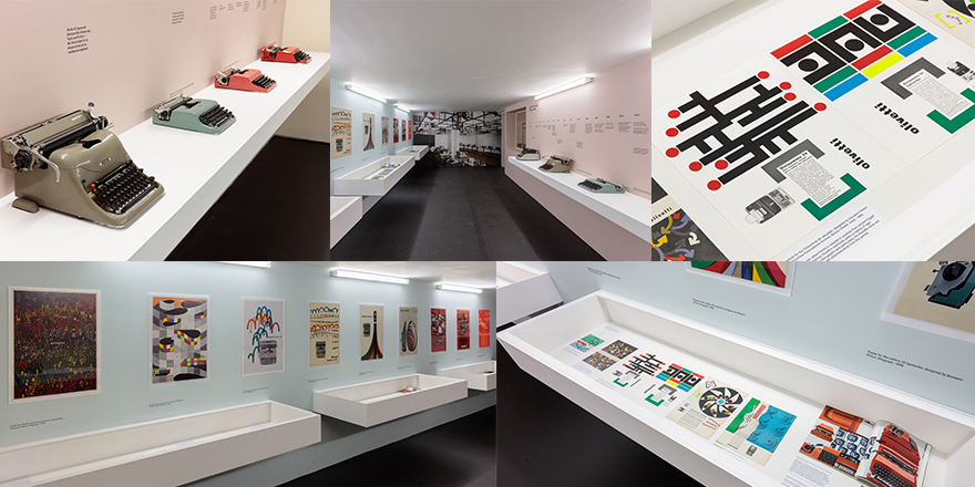
One of the first impressions to greet you, as you enter the Fox Reading Room, is the colour and vibrancy of this intimate look at the post-war rise of Olivetti. Delightfully curated by Juliette Desorgues and in collaboration with Associazione Archivio Storico Olivetti, Ivrea – Italy, the exhibition explores how Olivetti’s philosophy to innovative design did not stop with the products alone but continued through to extremely inventive communications demonstrated by their approach to advertising, promotion, architecture and interior design.


On display are early models of Olivetti typewriters including a 1963 Lettera 32 in salmon pink, designed by Marcello Nizzoli and the Valentine designed in 1969. Even looking through today’s 21st Century eyes the Valentine, in particular, has the aura of the ‘must have’ tech product of its day.


But what really excites in this exhibition is the graphic design, artwork and architectural images on display.


Olivetti created a graphic design department in 1937, headed by Giovanni Pintori, with the task of blending product design with advertising and promotional campaigns. As a result we are treated to Olivetti posters, designed by Pintori and Herbert Bayer in the late 1940’s and early 1950’s, which deliberately overlook the use of product shots in favour of graphics, typography and colour. These are works of art but it still must have been a brave move to produce marketing posters that display no pictorial reference to the product you are selling.


This attitude toward creative marketing is also borne out in the advertising campaigns designed by Pintori. These show a bold use of primary colour and graphics with the products themselves often shown in black and white and quite small in proportion to the size of the advert. We were particularly struck by the advertising for the Divisumma 24, which demonstrates Pintori’s interest in ancient symbols.


Olivetti’s philosophy to innovation can also be seen in the showrooms created during this post-war period. The New York showroom, opened in 1954 and designed by Italian firm BBPR, was intentionally devised to be a striking piece of architecture and interior design. The showroom included a large moving display wheel, pink and green marble, murals and demonstration machines with which the passer-by could interact.


The exhibition also includes an Educators Tour, Gallery Tour and panel discussions and is part of the London Festival of Architecture 2016. For further details please visit www.ica.org.uk


The exhibition runs until 17th July 2016


Image credits: Photography ICA


This review was first published for Arts Thread 27th May 2016

Wiro-bound polypropylene booklets

Printed polypropylene wiro-bound booklets are extremely robust and ideal for producing manuals, training aids, guides, handbooks etc. As a totally bespoke product, wiro-bound booklets can be printed from single to full colour with a variety of varnishes and laminations plus the added advantage of a write on/wipe off facility. Finished with a range of coloured wire in sizes to perfectly suit the extent of the project, wiro-bound booklets are an ideal communication tool. Contact us now for further information.

How to take control of your door drop & mailshot campaigns

Having recently managed a mailshot and door drop campaign it started me thinking about how best to improve your chances of a decent return. What is the best strategy? It seems clear that a generic ‘Could you use my service?’ or ‘We are looking for new customers’ approach is not only a waste of money but also a waste of your valuable time.

Being specific and targeting a certain group will surely increase your chances of positive feedback and help you to take control of the campaign. But how do you do that? How do you find this unknown group when you don’t know who they are or where they live?

Let’s take a hypothetical situation; a letting agent is planning a mailshot and will door drop 5k homes in the local area. As mentioned earlier sending out a generic message is a waste of time so let’s look at being specific and target a certain group. However we need to look at the possible numbers first.

Of these 5k homes how many are landlords or potential landlords? Probably not many, but how many would this be if we also include people who know family members, friends and business contacts that are landlords or potential landlords? This figure is much more interesting but let’s be conservative and say 5% – so we are now looking to engage with 250 possible landlords.

Now the trick is to engage with them on one important and specific issue. What would be their one major concern or worry; Health and safety, rental income protection, vacant properties, security, inventory and property protection. All of these I would say, but we are only choosing one concern on this occasion so let’s take rental income protection and create our content and campaign around this one issue. So we might now ask ‘Is your rental income protected?’

We now have our content but remember that we don’t know who these people are or where they live but we have taken more control by asking this one direct and specific question.

But of these 250 possible new contacts how many already have rental income protection? I would estimate that the majority do not but, again, let’s be conservative and say 50%. So we are now looking to engage with 125 possible landlords and potential landlords. This is where you need to take a deep breath – forget the other 4,875 homes. They won’t engage and most likely will throw your mailshot in the bin without even a cursory reading. But don’t worry. You only need to concern yourself with the 125 possible landlords you have managed to interest.

Now is the most important stage. If you have created a motivating ‘call to action’ these new clients will contact you but you must have comprehensive content to reinforce and expand on your message. This may be the form of a fact sheet, blog post, 1-2-1 consultation, local advertising or further on-line content but whatever you choose this is the moment to ensure you don’t waste the opportunity your mailshot has presented to you. You should also be backing up your campaign with local advertising, social media and blog posts which all convey the same consistent message.

Remember, you don’t know which of the 5k homes the 125 possible contacts will come from but the two components you can control are the content of the mailshot and the way you deal with the response to your ‘call to action.’

LetterBoxLetterBox

Informing you on …… Information Cards

Mad_Mimi_Info_Cards

Printed onto a durable plastic, information cards are a robust, stylish and long-lasting Sales & Promotion tool. They can be supplied as helpline cards, ID and security tags, door hangers, loyalty & membership cards and for many other applications. Available from single to full colour print, in short and long run quantities and can be personalised if necessary. Contact us now for further information.


Interesting info to share…

MadMimi_Design

Formula11 are now able to offer a full graphic design service including brochure design, point of sale and sales & promotional design, corporate literature, in-house photography and packaging design. Contact us now to find out about our competitive rates. And don’t forget you can still request our lenticular and materials fact sheets via our contact page.

Add a little bit of sparkle to your next campaign

MadMimi_Mirri_Boards
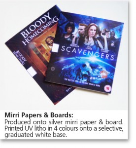
And here’s how…… Using Mirri Papers & Boards attracts the attention of the consumer and maintains their interest long enough for you to convey your message. And you can choose from a variety of colours including silver, gold, mirror and many multi-glitter patterns. All our Mirri Papers & Boards are printed UV litho in full colour so you’ll be guaranteed the finest quality. An excellent communication device for direct mail, sales & promotion, point of sale, packaging and publishing. Contact us now for further information.

Choose Theme Options


Predefined Color Skins
BG Patterns for Boxed

By continuing to use the site, you agree to the use of cookies. more information

The cookie settings on this website are set to "allow cookies" to give you the best browsing experience possible. If you continue to use this website without changing your cookie settings or you click "Accept" below then you are consenting to this.

Close